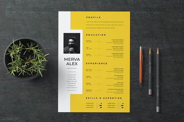
In today’s competitive job market, the right resume can make a huge difference. Creative resumes can stand out from the crowd, especially when they’re well-designed and express your experience expressively
However, they can present challenges if they don’t take into account keywords. This is why it’s important to understand how to use creative resume templates correctly.
Table of Contents
It’s a conversation starter
There are a lot of creative ways to design a resume. The key is to find and check resume sample that is both visually appealing and easy to read. It’s also important to choose a font that is easy on the eyes and looks professional. Sans-serif fonts are typically the best option. Avoid using cursive script, as this can be difficult to read.
Another great way to make your creative resume stand out is by adding a personal logo. This can give the impression that you are a unique individual with a sense of humour and personality. It can also help you get noticed by the hiring manager.
It’s a candidate market out there, and you need to do everything you can to stand out from the competition. Creative resumes are an excellent way to do this, but you should keep in mind that they should be professional and grammatically correct. If they aren’t, hiring managers won’t take them seriously.
It’s easy to read
Regardless of your profession, you can still use creative resume templates to help your application stand out. However, it’s important to keep in mind that the resume needs to be easy to read. You should use simple fonts and avoid using a lot of colours. If you do use colour, make sure it complements the rest of the page.
If you want to take your resume to the next level, try implementing unique graphics into your design. This could include levels for your sections, pictures of characters from past projects, or other graphical elements.
A great way to make your creative resume easy to read is by listing your work experience in a timeline format. This will allow hiring teams to quickly get the information they need and will help them identify your key skills. Also, try to avoid repeating the same job duties in different paragraphs. This will not only confuse the reader but it may also be interpreted as inconsistency.
It’s visually appealing
With hiring teams receiving hundreds of applications for every job ad, your resume needs to stand out. This is where creative resumes come into play, allowing you to add your personal touch. However, you need to be careful with this approach. Using too many elements can make the resume difficult to read. Additionally, it’s important to use readable fonts. A good rule of thumb is to use sans-serif for the headers and serifs for the details, as long as the two fonts pair well together.
This creative resume uses a bold colour palette and a clear layout to make it easy to read. The consistency of the colours and fonts helps to draw attention to the most relevant information.
Another creative resume example is this one, which looks more like an infographic than a traditional document. It uses a side-scrolling format to showcase your skills in a fun way. It also includes a “professional summary” to help the hiring manager quickly find the information that matters most.
It’s original
As the job market becomes more competitive, it is increasingly important to stand out from the crowd. Creative resumes can be a great way to do this, as long as they are well-designed and professional. They can also be a unique way to showcase your personality and skills.
Creative resumes can be a great way for applicants to show off their personalities, but they are not appropriate for all jobs. If you are applying for a position in a conservative industry, consider using more traditional elements to make your application look more impressive.


