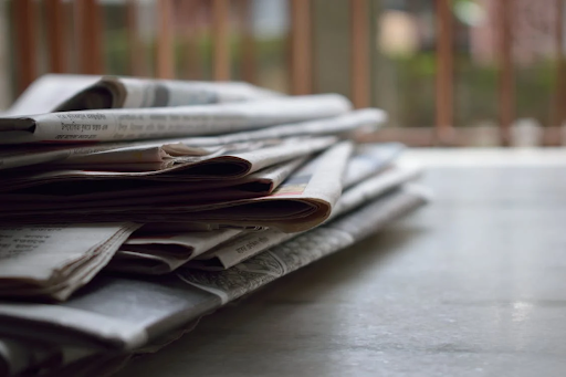
Maybe you’ve got a school project to design your own newspaper, or maybe you are just curious about the process. Whatever the reason, this article will comprehensively cover all the elements required to make your own well-designed newspaper.
And if you’re looking for a newspaper maker — StoryboardThat is your perfect go-to for creating the best newspaper online. Their customizable templates are great for poster-sized projects and are super easy to alter to your requirements.
Table of Contents
The Elements of Newspaper Design
There are three main categories of newspaper design elements: page layout elements, visual elements, and invisible elements. These are discussed below:
Page Layout Elements
- Nameplate: The newspaper company/publication name and its logo. This logo can be a graphical element or stylized text, although serious companies prefer text-only nameplates.
- Table of Contents: List of the articles and sections with page numbers.
- Headers and Footers: Text at the top and bottom of the body copy margin, respectively. Include datelines and folios containing the document name, page number, and reference information.
- Headline: Larger type line of text to draw attention. May have subheadings to break the following text into shorter segments. Includes Crossheads that break up long articles, so they’re easier to read, and Dropheads that provide additional information.
- Kicker: An underlined one- or two-word smaller-font headline just above the main headline. Used to classify articles.
- Hammer: A three- or fewer-word larger headline above a smaller main headline. Used to attract attention to a major article.
- Location: In bold at the beginning of the article.
- Lead: First sentence or paragraph that captures the reader’s interest and explains what the article is about. Should be short and snappy.
- Deck: Short summary of the article to get the main point across without having to read it all.
- Byline: Name of the writer and his or her staff position. Usually at the beginning of the article.
- Body Copy: Main content of the article. Divided into paragraphs.
- Sidebar: Smaller article or list of facts accompanying the main story in a box to provide additional context or information.
- Jump Lines: Lines of text indicating where an article continues on another page.
- Pull Quotes: Quotes taken from the article and retyped in larger font to draw attention and emphasize a point.
- Caption/cutline: Text accompanying photographs or images to give readers a bit more detail.
- Editorials: Opinion pieces by the newspaper’s editorial board or guest contributors. Provide commentary and analysis.
- Guest Columns: Articles written by experts or community leaders as guest contributors. Provide a unique perspective.
- Advertisements: Paid messages from businesses or individuals. Included to generate revenue.
- Pull-out Sections: Special sections with the ability to be removed and read separately.
- Supplements: Additional sections like a weekly entertainment guide included on a regular basis.
- Corrections: Notices correcting previously published errors or mistakes.
Visual Elements
- Photographs: Visuals that help illustrate the story and make the text more interesting and easier to understand.
- Artwork: Graphical elements like cartoons and illustrations that appeal to readers via entertainment and humor.
- Infographics: Visual representations of data like charts, maps, and diagrams. Help illustrate or support a particular argument.
- Rules: Straight lines used to separate columns of text or information.
- Boxes: Used to distinguish the edges of photographs, artwork, infographics, teasers, or sidebars.
- Borders: Group-related elements together like a bunch of boxes.
- Bullets: Small circles or squares used to accent items in lists. Shouldn’t be larger than the text font.
- Dingbats: Can be used as bullets but are regarded as artwork. Include international symbols, computer icons, and other small drawings.
- Teasers: Little boxes of artwork and headlines. Found on the front page and tease you to read the article.
Invisible Elements
- White Space: Any empty space or space without ink. Determines the “openness” of a layout.
- Margins: Area of white space serving as a buffer zone to keep printed elements from bumping into each other or running off the page. Has several types.
- Gutters: Margins between columns or pages. Greater than the edge margin needed for bookbinding.
- Grids: The layouts’ underlying geometric pattern guiding the placement of visible elements. May not be a rectangle.
- Frames: The individual shapes in a grid.
- Columns: Made by dividing text frames. Must be constructed carefully, as can be hard to read if too narrow or too wide.
Conclusion
Even common printed elements have unique names in publishing. This is necessary information when designing a newspaper, so we have shortly covered the most relevant terms above.
A balanced use of elements is a hallmark of good design. As such, invisible elements should be positioned properly after much consideration, while grouping elements like rules and boxes should be used with restraint.


