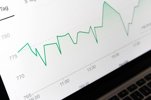
Business data representation has come a long way. With evolving technology, the methods to exhibit important information have greatly improved, making it easier than ever to understand patterns and trends. Among the many tools used in businesses, line charts are considered to be one of the most effective. In today’s data-centric world, understanding line charts, their types, and their relevant application in business has become crucial. Therefore, this article aims to delve into the world of line charts, providing crucial insights into the various types of line charts within the business landscape. Keep reading to expand your knowledge and understanding of this versatile tool.
Table of Contents
Essence of Line Charts
In the vast horizon of data visualization, line charts hold a significant position, ensuring ease in comprehension and interpretation of trends over a span of time. Their simple representation format provides direct insights into patterns and enhances the understanding of evolving trends. This simplicity is an asset in a business environment where quick absorption of information is often a necessity.
Among the various line charts employed, standard line charts, stacked line charts, 100% stacked line charts, and step line charts are commonly used. Even though these charts are simple to interpret, creating a line chart is a task of precision that requires attention to detail. Getting data points accurate, choosing the right scale, and choosing a simple yet insightful representation style can make a world of difference in the efficacy of the line charts created.
Standard Line Charts
A standard line chart, also known as a simple line chart, is the most basic type of line chart and is frequently used due to its simplicity and direct presentation style. It represents information through a series of data points connected with straight lines. As the simplest to construct and read, a standard line chart makes a perfect tool for presenting clear data on a project’s progress or monthly sales figures.
Businesses often employ standard line charts to track changes over time, especially for demonstrating trends rather than conveying exact values. Since it provides visual simplicity and a clear main trend line, this type of chart remains the ideal choice when dealing with small data sets or single categories.
Stacked Line Charts

Stacked line charts, a variation of the standard line chart, allow visualization of multiple data series. These types of charts are particularly useful when one needs to demonstrate the total size of groups and their composition simultaneously. Notably, each line represents a different group, and individual data points along the line reflect the percentage each group contributes to the total.
This chart plays a vital role in explaining complex data collaborative scenarios, such as convoluted sales data from multiple regions or varied products. Thus, stacked line charts, with their knack for making complex data readable, hold prime importance in the business world, especially in visualizing and analyzing detailed data layers.
100% Stacked Line Charts
100% stacked line charts are a further adaptation of the stacked line chart and are particularly beneficial when analyzing the proportion of each subgroup over time rather than the total cumulative count. In these charts, each line is scaled to represent 100%, and individual data points on the line show the category’s proportion of the total.
They are typically used when it’s important to compare relative differences within categories, and the combined total of categories doesn’t hold particular significance, like when looking at market share percentages over time. It provides a detailed view of how the contribution of different factors changes over the time period being analyzed.
Step Line Charts
Another variant, the step line chart, deviates from usual line chart patterns by connecting data points with horizontal and vertical lines to create steps rather than using diagonal lines. The advantage of this type comes into play when one needs to emphasize changes occurring at irregular intervals.
Typically businesses use them when changes are abrupt rather than gradual, such as price changes or policy changes. By preserving the integrity of each individual data point, step-line charts offer a more complete snapshot of trends. The precise nature of these charts makes them an excellent tool for analyzing the granular details of data changes.
Altogether, the utilization of line charts in business is incredibly substantial. They assist in decoding the varied business data, making it readable and easily comprehensible. As they continue to evolve, their prime focus remains the same— to provide clear, insightful business data for effective, data-driven decision-making.


